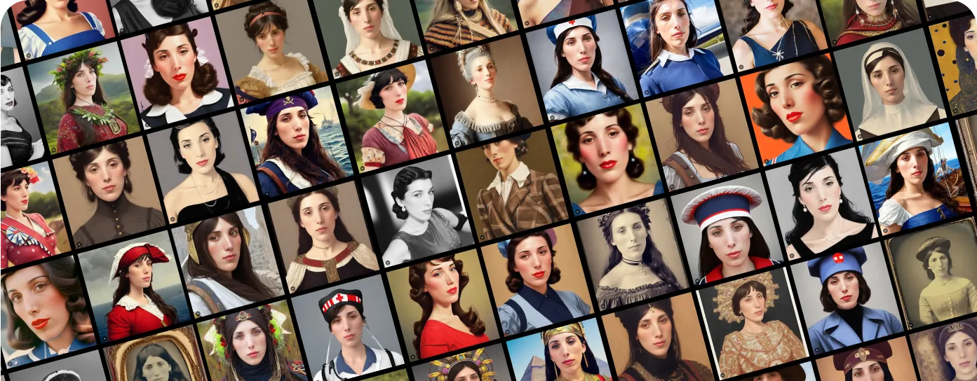
AI Time Machine | MyHeritage
An AI-powered photo feature that transformed selfies into historical portraits. Driving 47M TikTok views and 1.2M new users. Designed to attract Gen Z and make family history relevant to a new generation.
Impact
- Organic Traffic
- +1.36M
- Organic Visitors (YoY +42%)
- New Registered Users
- +1.2M
- New Users
- Photos Uploaded
- +42.8M
- Photos
- Social Reach
- 47.4M
- Views on TikTok
Overview
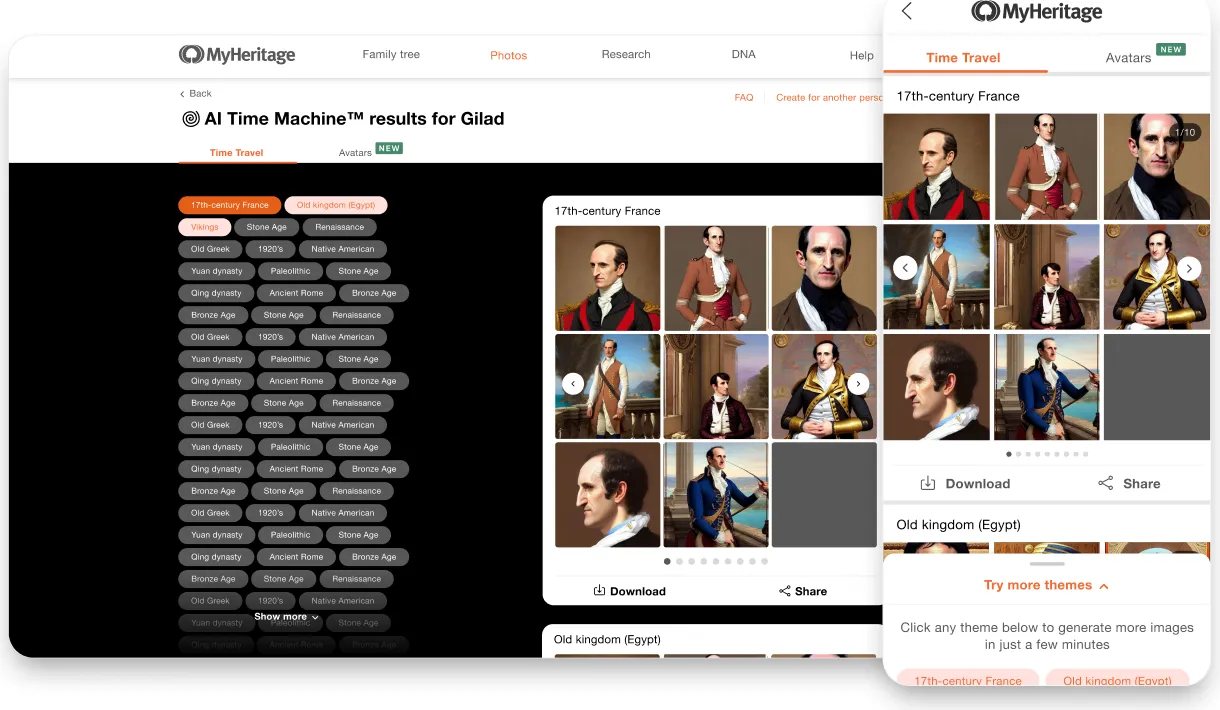
AI Time Machine™ is a generative AI feature that transforms user-uploaded photos into hyper-realistic portraits from different historical eras.
Created to attract younger audiences and boost brand awareness, it combined MyHeritage’s photo innovation with trending AI technology to make family history feel personal and shareable.
As the sole product designer, I led UX strategy and end-to-end design across mobile and desktop. The feature became one of the company’s most viral launches, bringing in over 1.2 million users and 47 million TikTok views.
- Role
- Product Designer - led end-to-end product design for viral AI feature, from research to launch.
- Platforms
- Desktop & Mobile Native
- Team
- Product designer, 2 PM, FE, QA
- Timeline
- 2022
The Problem
Reaching the Audience That Wasn’t Reaching Us
MyHeritage is a platform built around family research and historical discovery. Its tools help users uncover their ancestry, build family trees, and connect across generations.
But while the platform had earned the trust of millions, its core user base was aging - primarily people over 50, with a significant portion in their 70s.
Younger generations, particularly Gen Z and Millennials, weren’t engaging with the platform or its mission.
How do we make family history feel relevant, exciting, and emotionally engaging for younger users who don’t naturally seek out genealogy and often feel disconnected from traditional family research tools?
Research
- 🧠 User Interviews
- 🗺️ Competitive Analysis
- 📱 Usability Testing
- 📊 Trend & Market Analysis
- 🧍 Personas
Research Summary
We conducted qualitative interviews with young adults aged 18–35, including students, creators, and casual users of AI tools. We asked them how they engage with family-related content, their perceptions of genealogy, and their experiences with AI-generated visuals.
We also performed a competitive analysis of trending AI photo apps like Lensa and Remini to understand onboarding patterns, usage motivations, and shareability factors.
Voice of the User
“Family history never really felt like something for me. But if it was fun, visual, and showed me something new about myself, I’d definitely give it a try.”
Main insights

Younger users engage most with experiences centered on themselves

Genealogy is often perceived as complex, time-consuming, or boring

Gen Z engages most with fast, visual experiences they can share
Competitor Analysis
We analyzed leading AI photo tools like Lensa, Remini, Lighttricks, and AvatarAI, alongside genealogy platforms such as Ancestry and existing MyHeritage tools.
The results revealed a clear whitespace in the market:
- Most AI photo apps focused on visual novelty - filters, avatars, and quick trends, but lacked emotional or historical meaning.
- Conversely, genealogy platforms offered deep personal stories but felt static, formal, and less shareable.
AI Time Machine™ was designed to occupy the middle ground - a product that blended visual virality with personal and cultural relevance.
It wasn’t just about creating AI portraits; it was about giving users a way to see themselves through time. Bridging personal identity with family heritage.
How Might We
From our insights, we defined three guiding “How Might We” questions to steer ideation and design.
How Might We
use AI to create hyper-realistic portraits that connect users to the past?
Ori Shraiber
How Might We
make family history feel relevant and emotionally personal for younger audiences?
Ori Shraiber
How Might We
remove friction and make the experience simple, fast, and playful?
Ori Shraiber
🛠️ Design Process & Iteration
Throughout the project, we followed a lean, iterative design approach - continuously prototyping, testing, and refining both the concept and the UX.
Each design decision was informed by a mix of qualitative user feedback and quantitative product data, helping us validate assumptions, remove friction, and increase engagement at every step.
Challenge #1
Reducing Cognitive Load:
Eliminating Prompt Complexity
Traditional text-to-image platforms required users to write long, detailed prompts to generate quality results, which was a complex process for a novice.
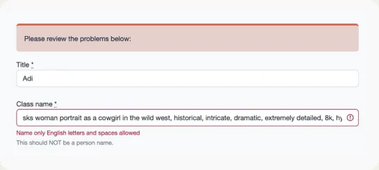
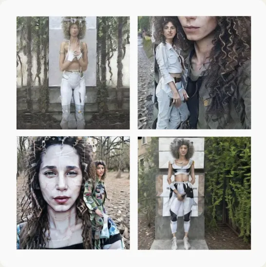
Poor prompts would produce poor images
Our Solution
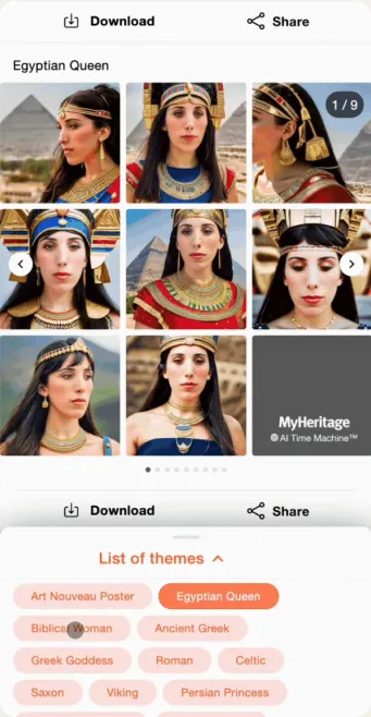
We removed prompt writing entirely, replacing complexity with curated, tap-to-start historical themes
In commitment to delivering a smooth user experience and staying true to our core objective of historical and family research, we gave users the option of selecting curated historical categories at their discretion instead. This restriction expanded user possibilities, simplified the UI, and made the feature faster and more user-friendly.
Challenge #2
Reducing Drop-Off by Rethinking the Photo Upload Experience
Building a personal model meant uploading 20-35 photos in different poses - not an easy task for most users.
Even for me, it took real time and effort to collect 20 suitable photos - and I was highly motivated to complete the task.
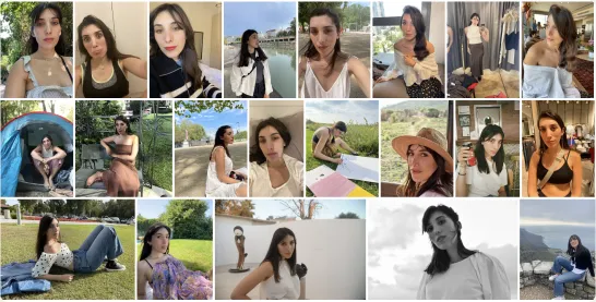
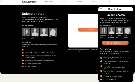
We underwent numerous iterations to define the most accurate guidelines.
Initially, we thought using illustrations would enhance understanding for selecting the best images. However, the data told a different story: the provided images were causing confusion
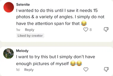
As the feature gained early traction on social media, it quickly became clear that the photo upload process was a major blocker.
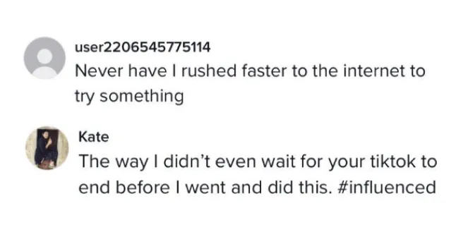
Through TikTok comments, support tickets, and community threads, we repeatedly saw the same frustrations surface:
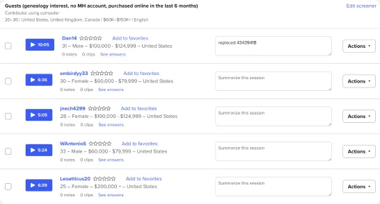
User testing
I proposed a quick experiment: giving users just one simple upload task.
The results were surprising.
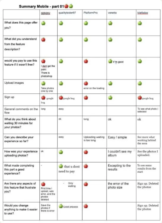
User testing results
I noticed that users were less concerned about the number of photos and more about the strict requirements - such as uploading images with minimal makeup and without sunglasses.
Many struggled to complete the task.
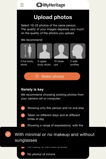
I tested a friendlier version of the requirements using example photos instead of plain text.
However, once released, the data told a different story - the visuals actually confused users rather than helping them.
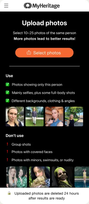
Our Solution
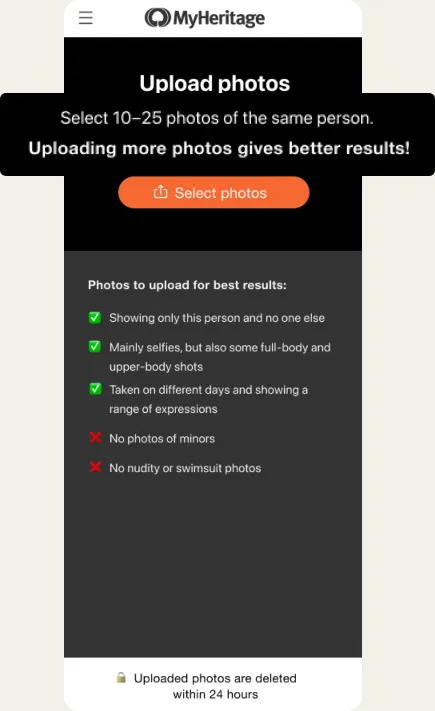
Less Instruction, More Completion
The insights led us to realize that less is more. I took a different approach:
- 🎨 Removing photo examples and illustrations that caused confusion
- ✂️ Replacing detailed photo requirements with short, friendly tips
- ✅ Lowering the photo minimum while assuring users they could proceed
- 💬 Using conversational, confidence-boosting copy (“Uploading more photos gives better results!”)
📉 This simplification proved effective, resulting in a significant drop in user abandonment.
Challenge #3
Turning Wait Time into a Storytelling Moment
Generating a personal AI model could take up to 30 minutes.A delay that felt especially long for our target users, who are used to instant results from digital tools.
Without a thoughtful intervention, this waiting period risked becoming a drop-off point where users either forgot about the experience or lost interest before their results arrived.
Our Solution
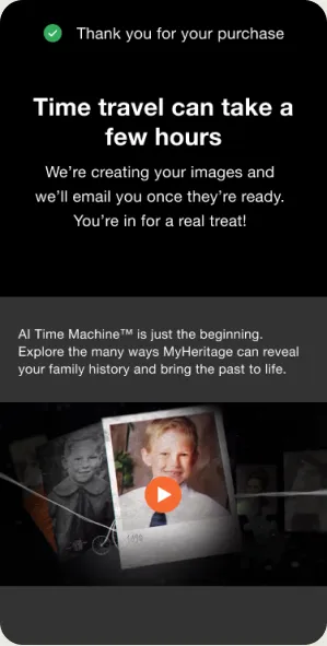
We turned a technical delay into a moment of curiosity and brand discovery.
Instead of leaving users idle, we used this downtime as an opportunity to spark interest and deepen engagement:
- ✅ Users were informed transparently that the process may take time using playful language (“Time travel can take a few hours”)
- 📽️ A custom video teaser was embedded during the wait screen. Specifically crafted to appeal to Gen Z’s curiosity and storytelling preferences
- 📧 Re-engagement via email notification brought users back at just the right moment when their AI portraits were ready and excitement was high
By reframing the wait as a journey instead of a delay, we kept users emotionally connected and turned a potential churn moment into a touchpoint for brand storytelling and discovery.
The Launch: Going Viral
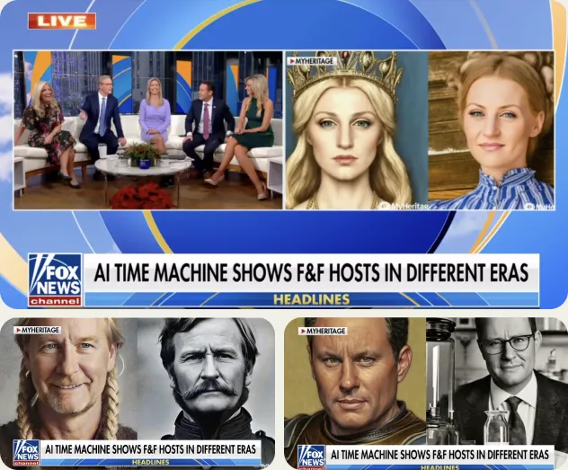
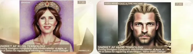
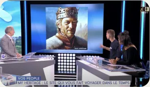
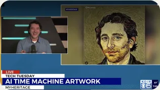
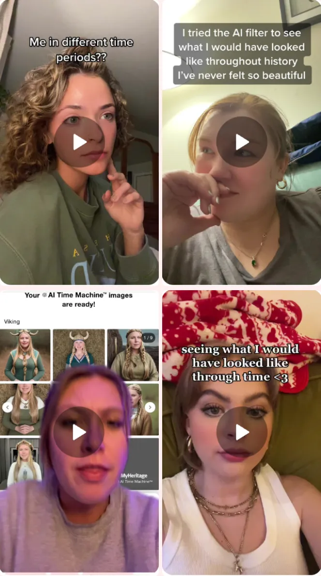
The launch was exhilarating - AI Time Machine™ went viral almost instantly. The feature received global coverage on TV shows and news sites, while millions of people shared their results on social media. Most notably, it became a trending sensation on TikTok.
News
Daily Mail
Ever wondered what you would have looked like during the Viking Age? AI 'Time Machine' transforms your photos into hyper-realistic images from history
The Sun
WE ARE FAMILY What is MyHeritage’s AI Time Machine and how long does it take?
Yahoo!
“Time Travel via Selfies? Yes, Please! What To Know About This Instantly-popular AI Photo Trend”
CNET
“How to Use MyHeritage’s ‘AI Time Machine’ and Send Your Face Back in Time”
Bustle
“This AI Filter Shows How You’d Look In Different Time Periods”
Business Insider
“This app lets you see what you would be like in Victorian times, Ancient Egypt, hippy splendor, or outer space”
Infobae
“This is how you can see how a person would look at different times in history. Looking like a medieval knight or a 19th century woman is possible thanks to this artificial intelligence tool”
TV shows
Morning shows all over the globe were presenting AI Time Machine™

#aitimemachine
47.4M views
Accomplishment
Business Impact — November 2022
AI Time Machine™ created a massive surge in growth within just one month:
- new registered users
- +1.2M
- photos uploaded
- +42.8M
- organic visitors (YoY +42%)
- +1.36M
- AI Time Machine models trained
- +978K
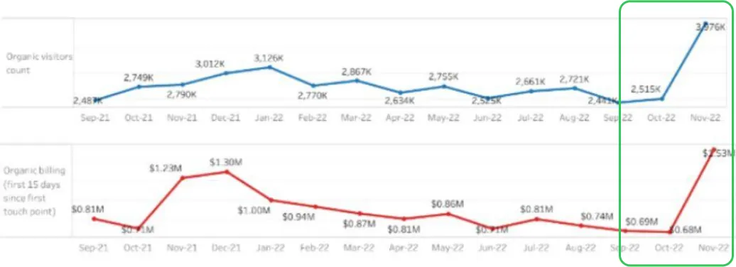
📈 This single feature drove a record-breaking spike in engagement and organic traffic.
Takeaways and Lessons Learned
We embarked on a mission to create an engaging and user-friendly feature aimed at piquing the curiosity of a younger generation. The project’s virality and predominantly young user base confirmed we successfully fulfilled the mission of connecting them to their family research and heritage.
I’ve learned that:
Data Over Assumption: Our approach consistently relied on user testing feedback and data. My initial assumption that visual aids would help users understand photo guidelines was disproven by data, which showed the visuals caused confusion. Pivoting to concise text requirements significantly reduced abandonment rates.
Focus on Essential Elements: Working under pressure taught me how to make quick decisions and prioritize essential elements, striking a necessary balance between what is crucial for a great feature and what is merely a ’nice-to-have’ addition